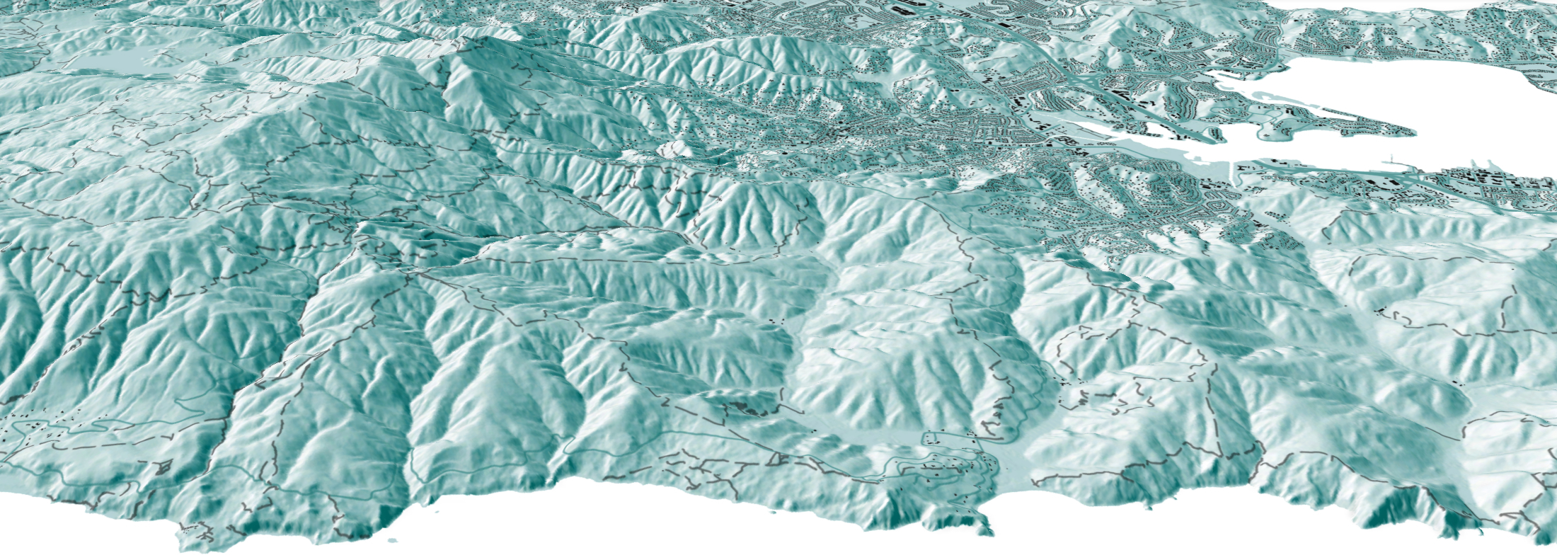
Visual Design Presentation
ESRI
GreenInfo team: Larry Orman, Maegan Leslie Torres, Stephanie Ding, Tim Sinnott
Project years: 2014-2018
Tags: Applications Development Conservation Economic Development Environment Interactive Solutions Presentations Publications Social Justice/Equity Web Mapping
Overview
What challenges is this project trying to solve?
- Visual design is a key component to effectively tell stories through maps, and it is a skill that takes practice and studying to learn.
What were the client’s objectives?
- ESRI is a flagship player in the GIS world and has cultivated a community of people from different sectors and want to hone and build that community through collaboration
- Many people who interface with ESRI systems may want to hone their craft and to learn more about the visual approaches to effective mapping.
Results
- ESRI holds their user conference annually and invites partners to hold training workshops for attendees. Between 2014 to 2018, Greeninfo's presentations have reached of 2-300+ attendees, exceeding expectations.
The Work
Background
GreenInfo has long been supported by Esri, the leading GIS publisher, and its conservation program which donates ArcGIS software used heavily by GreenInfo. Ever year, Esri holds a major User Conference with over 15,000 GIS users, featuring hundreds of workshops and other learning sessions. Based on discussions between GreenInfo and Esri at the 2013 conference about the quality of maps being exhibited by users, Esri underwrote the development of a three part presentation series for 2014, co-created by GreenInfo and Esri staff:
- An overview session on design and communication
- A session focused on maps for print and fixed images
- A session focused on web map design
The content for these sessions was worked out in sessions with Esri staff and drew on years of GreenInfo presenting on these topics, as well as doing hundreds of mapping projects annually. GreenInfo took the lead on defining approaches to visual perception and process and guidelines for print maps, while the Esri staff focused more on web map design, featuring Esri’s Story Maps technology.
Presentations
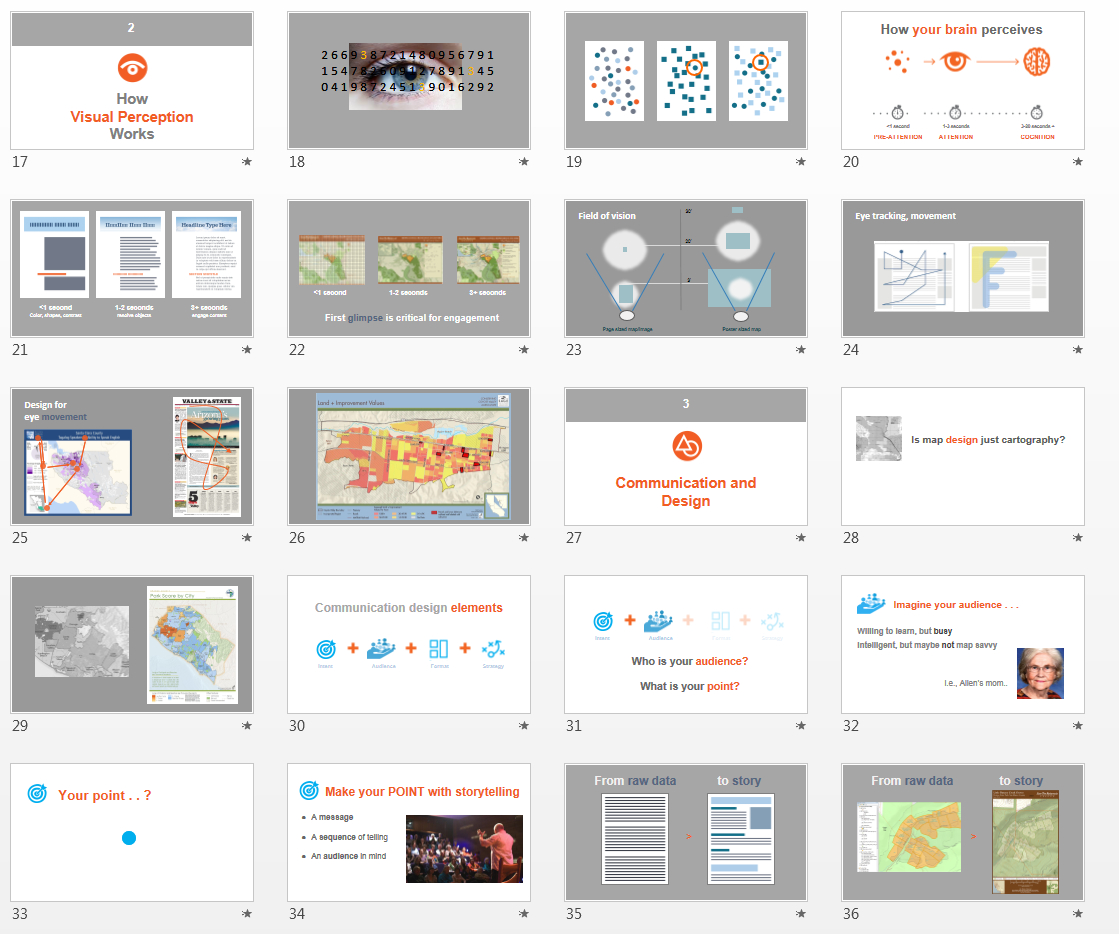
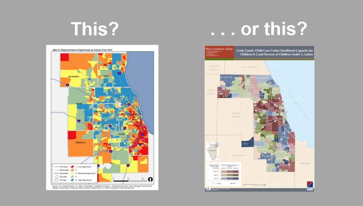
The PowerPoint presentations that resulted were custom designed for 75 minute sessions and contained over 70 slides each, and were co-presented by GreenInfo’s Larry Orman and Esri’s Allen Carroll, leader of Esri’s Story Maps division. They feature concept illustrations, before and after maps, demonstrations of how to improve a less-effective map, steps in good visual design, map design pitfalls and more – GreenInfo staffers Maegan Leslie Torres, Stephanie Ding, and Tim Sinnott (plus others) contributed maps. Our outside design partner, Ison Design, helped with the original presentation graphics for the PowerPoint.
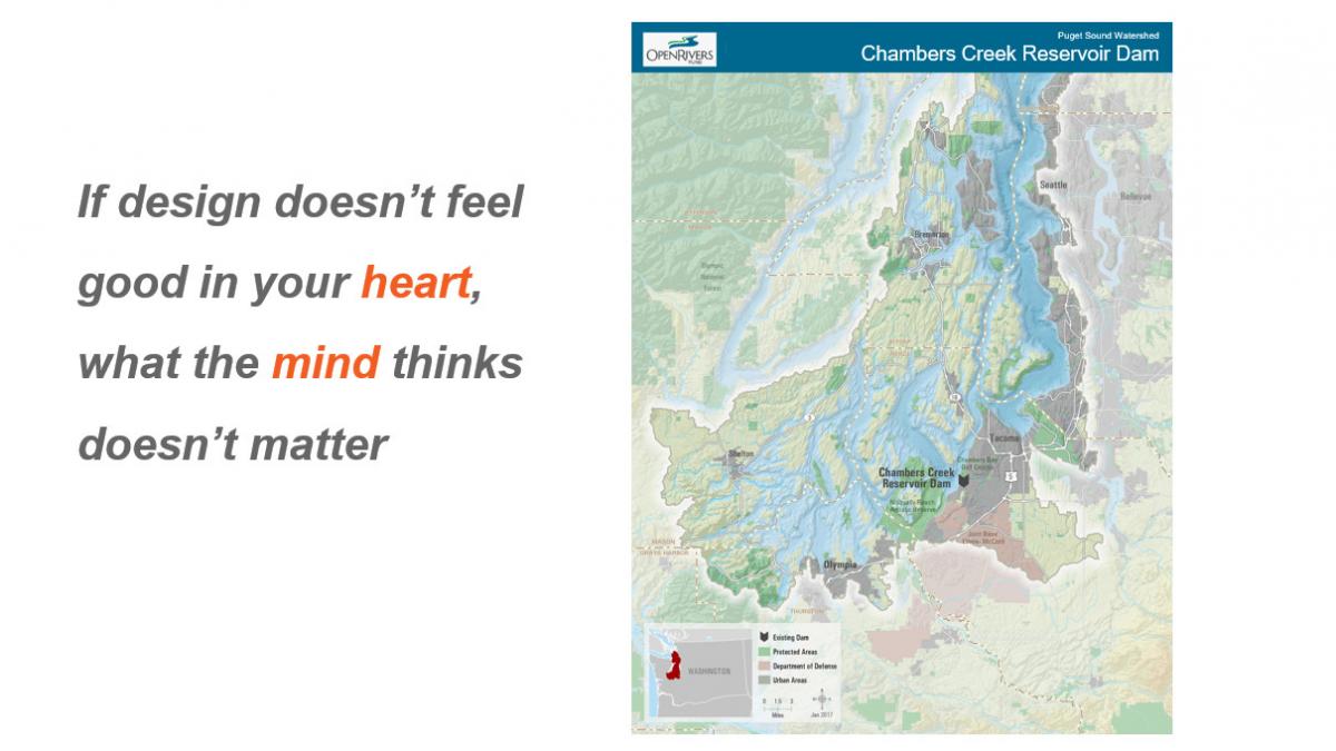
GreenInfo has long maintained that GIS can be used to produce outstanding maps, as long users follow these principles. In particular, it is vital that the end-user is kept closely in mind and that design occur near the beginning of a mapping project, not as an afterthought. The enthusiastic reception at the User Conferences for this information shows that it resonates strongly among the GIS community – and hopefully results in ever-better maps for all of us to see and use!