Similar Projects | All Projects for Client
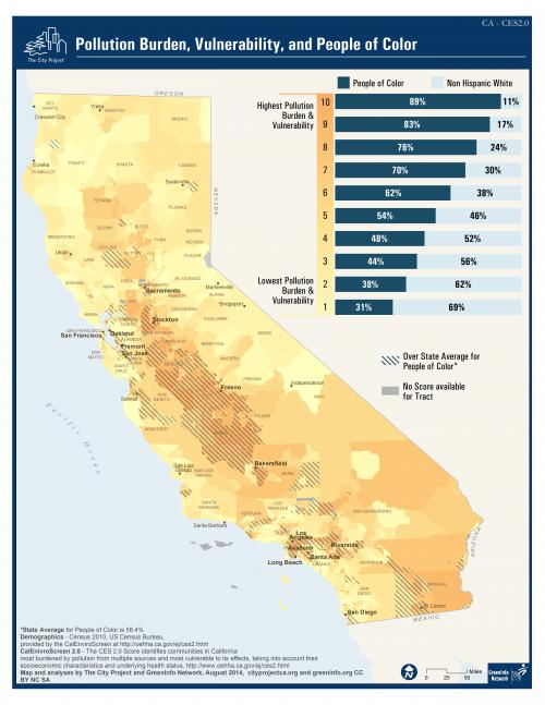
The City Project focuses on the needs of people of color and underserved communities generally, and GreenInfo has been their mapping partner for many years. Looking at new environmental pollution data, The City Project asked GreenInfo to develop a visualization that could be used for presentation.
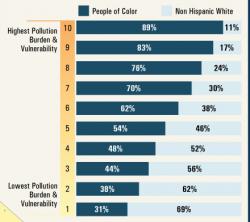
GreenInfo expected the a correlation of poverty, underserved communities, and pollution, but we were surprised to see the figures so clearly show the connection. We designed the bar chart to be up top and visually striking - the simple graphic allows readers to see the results before focusing in on the details on the map.
Results: Using readily available geographic data, GreenInfo Network was able to show a clear correlation between pollution and under-served communities.
Focus: Environment, Public Health, Social Justice/Equity
Services: GIS Services, Maps, Cartography
Tags: California, Esri ArcGIS
“ This is the most dramatic map we have produced!”
— Robert Garcia, Executive Director, The City Project
Project Years: 2014

