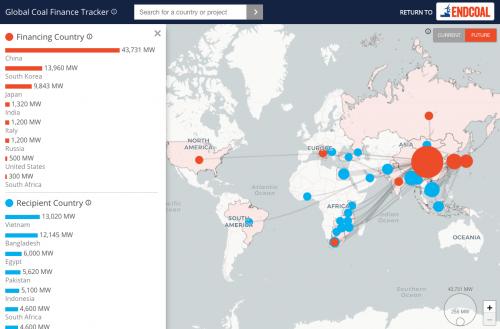
Building on the success of the global coal plant tracker we built for them, the team at Global Energy Monitor (GEM) came to us with a quick turn-around project to illustrate how much various nations are still investing in new coal plants, despite the ever-more-urgent challenge of reducing global carbon emissions to mitigate the impacts of climate change. And it needed to be ready in time for the COP24 climate talks in Poland in early December 2018.
Since 2018, we have built more trackers for GEM, from global oil and gas extraction, to global solar power, and more.
The goal of the 2018 map was to show the global flow of finance, so we knew that we did not just want a simple choropleth or scaled symbol map. We needed to draw connecting lines from source countries to recipients, while keeping the various scales of investment clear at a glance.
The solution was to adapt an existing open source
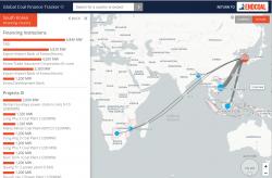
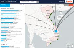
spatial Sankey diagram tool for the D3 data visualization library, and then design a simple but powerful search and filter interface, that allows you to quickly focus in on a single country as a source, or a recipient, and then from there to the actual projects in each recipient country. The sidebar on the left dynamically updates and includes a simple bar chart to help reinforce the scale of each funder, recipient, and project. It also includes specific information on the financing institutions.
The application runs off of a spreadsheet and uses all client-side technology, so it's easy to update and can be hosted on any web server.
The trackers we created after 2018 followed this design process as well.


