See This Project | Similar Projects | All Projects for Client
GreenInfo's work in developing a major presentation for the IUCN 2016 World Conservation Congress, highlighting North American conservation accomplishments, is described in more detail in the main project description. For this project, however, GreenInfo also worked with Esri's Story Maps team to apply their technology to creating a companion interactive presentation.
The task for this project was to create an exact duplicate of the main Powerpoint presentation that was delivered by U.S. National Park Service Director Jonathan Jarvis to the IUCN World Conservation Congress in Hawaii in early September, 2016. The presentation focused on a key report by the North American Inter-Governmental Committee on Cooperation for Wilderness & Protected Areas Conservation (NAWPA). The details of developing that presentation are described in this project entry »
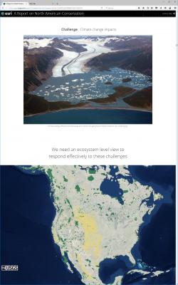
Story Maps are developed primarily on the Esri ArcGIS.com web portal, though it is possible to download the technology and create one's own story maps portal (allows for more detailed fine-tuning of the programming). Broadly, users select a template and then insert images/video, text and links to interactive maps (or web sites) using the template tools - this creates a very long web page, which a user can then scroll down (in the case of the Cascade template) at their own pace, moving back and forth as needed, and zooming into and around any interactive mapping that is installed. A very useful, though relatively limited, set of styling tools is used for fonts, fills, placements of text, etc.
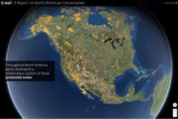
In this presentation, there were two main challenges - develop a globe view map of North American protected areas, and address how to achieve the best resolution for static map images intended to be full screen views. The Esri Story Maps team worked with USGS Gap Analysis Project staff to place protected areas data for North America into ArcGIS Online and to develop a technique for effective and rapid display of this very large data set. The result is a beautiful starting view of the continent, with the conserved areas showing - users can zoom in and change perspective on this live map. A second interactive map view adds the "other managed areas" - public lands not given the highest protections for biodiversity conservation. These maps take a few seconds to load at first, then move very quickly, as the data is cached.
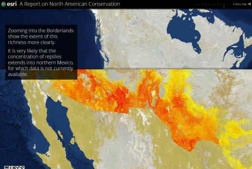
The second challenge was defining a strategy for having other images of maps show at best resolution. Story Maps can consume images from ArcGIS Online, or from Flickr.com. But these images are often downsampled, leading to fuzziness for full screen map images (vs. photographs which are less affected by this). Esri staff and GreenInfo found a way to bring in the full resolution images, which now display very well.
The Story Maps version of this presentation is a very helpful addition to the archive for the overall presentation - rather than only having slides to browse through, users can get a richer experience, as they scroll down through the Story Maps version, including the 3D globe maps. Story Maps technology is constantly evolving, with improvements to functionality and new styles coming along frequently. It's definitely a useful adjunct for communications with maps and GIS!
Focus: Conservation
Services: Interactive Solutions, Communications, Presentations, Web Mapping, Website Design
Tags: Esri Story Map
Project Years: 2016


