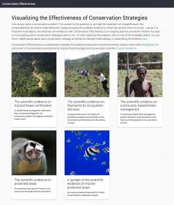
How do you know if conservation efforts are really working? Mongabay, an influential and widely visited news and investigative journalism website that covers more than 50 countries worldwide, asked GreenInfo to develop data visualizations to support a series of articles evaluating the effectiveness of the most popular tropical forest conservation strategies, including forest certification and payments for ecosystem services.
Founded in 1999 and originally focused on tropical forests and freshwater fish, Mongabay (named for a small island in Antongil Bay, Madagascar) has grown into a global environmental news service, now with more than 1.5 million site visits per month and 40 million annual users.
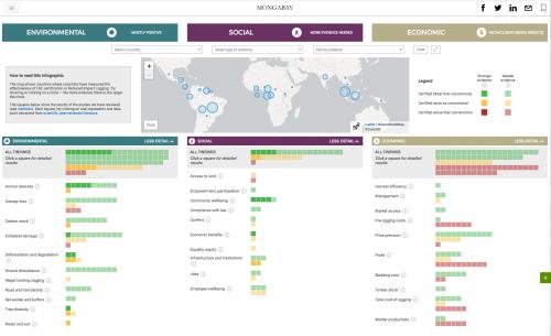
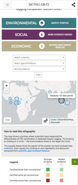
Our charge was to take that tabular data and present it in a way that allows both simple snapshot views and deeper dives into the details. A map shows countries where scientists have measured the effectiveness of FSC Certification or Reduced Impact Logging. The more evidence there is, the larger the circle. Hover over or click a circle, and you'll filter the data below by that country. You can also use menus to filter or sort by country, evidence-type, and whether the evidence is positive, negative, or neutral. The squares below the map show the results of the studies have been reviewed -each square (try clicking on one) represents one data point extracted from scientific, peer-reviewed literature.
To support this series of articles, we needed to develop an approach that was not only compelling, but that could also be easily reused and applied to the review of different conservation strategies. To achieve this, we worked with Mongabay staff and researchers to update shared spreadsheets of data and lookup keys that drive the visualization. From there we use the open source data visualization libraries D3 and Leaflet to render the maps and charts. One technical challenge was leveraging the power of D3 animations, which work best with SVG, while also taking advantage of the power of HTML for easily rendering responsive text, as a large portion of Mongabay traffic now comes from mobile users. The solution was to use SVG chart elements nested inside of HTML divs in a simple responsive grid.
For the first article on
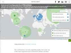
Forest Certification, we also developed a second, simpler map using
Carto.com's cloud-based map visualization tools, to represent the variation between countries with high percentage of FSC certification (mostly in Europe) and those with large forest tracts (such as Brazil and Russia). This second map takes advantage of Carto's built-in Postgres and CartoCSS tools to query and scale data and add simple popups and other effects with very little custom code.
Articles in the series:
In 2018, we came back to the project and built a new stand-alone microsite,
conservationeffectiveness.org, as a permanent home for the visualizations, with a full administrative backend (built in Python/Django) to allow program managers and others to create new visualizations and edit existing findings.
