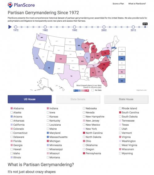
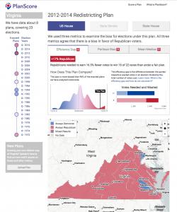
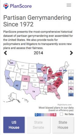
Partisan gerrymandering is a critical and complex problem that demonstrably favors some voters over others. A team of lawyers, academics, and open source developers came together to create PlanScore, and looked to GreenInfo to provide project sponsorship, identity design, interaction design, and rapid development of a website to showcase the most extensive dataset assembled about partisan gerrymandering in the United States — and to allow policymakers and journalists to freely test new plans for bias.
GreenInfo Network board member and PlanScore Executive Director Michal Migurski has been a leader in public-good uses of open data and open source tools for well over a decade, so we were thrilled when he approached us with the opportunity to help build and launch PlanScore.org, a showcase website meant for political reporters and policymakers working on redistricting nationwide.
Migurski had already begun working closely with
leading researchers and lawyers who had developed a metric called the Efficiency Gap and argued the major
Gill v Whitford case in front of the Supreme Court in October 2017. The PlanScore team needed a logo and a highly usable, well-designed website showcasing extensive but highly variable state-by-state elections data going back to 1972. The styles and page elements from the historical display portion of the site also needed to be easily adapted by Migurski to a separate part of the site that lets users upload new district plans and get extensive scoring back assessing their partisan bias.
And we had to be ready to launch quickly, in case the Supreme Court should release its decision early in 2018.
We rapidly began work on multiple fronts. Our partners at
Ison Design worked through a dozen logo iterations, working through options to highlight PlanScore as a trustworthy, credible source of information. GreenInfo's designers began developing interactive wireframes immediately based on real data, and then we conducted multiple iterations of user interviews with journalists and scholars, gradually refining the voice, look, and feel of the site each time.
As the user interviews progressed, we began building the site just before Christmas 2017. In the space of about two weeks before and after the holidays, we had a nearly complete site optimized for both desktop and mobile, emphasizing clarity, speedy loading, and thorough deep linking so that dozens of views of each state (year, house level, metric) are easily shared, and easily tracked in Google Analytics.
As we developed the main site, we also extracted the key elements into a "pattern library," which Migurski then used to build out other site features, including models to allow plan scoring for multiple key states, with more to over the rest of 2018.


